7 Steps to Choose Coastal Fine Art for Your Home Office

Last Updated: 30 October 2026
Quick Summary
To choose coastal fine art for a home office, start with the work you do rather than the wall: decide the mood you want to protect, build a restrained palette of one or two blues with warm neutrals and natural frame materials, then size and position the piece for your desk and video calls. Finish by picking a print material that suits your light, such as giclée paper, Chromaluxe HD metal or acrylic facemount.
- Hang the centre of the piece at roughly 120-140 cm from the floor for most desk setups.
- A framed width of about one-half to two-thirds of the desk width keeps art anchored to the workspace.
- Keep the bottom edge at least 15-20 cm above the desk to avoid crowding with monitors and lamps.
- One medium piece offset to one side reads better on video calls than a busy gallery wall.
- Painterly photography suits a workspace better than sharp, literal seascapes because it gives the eye a rest.
Table of Contents
- How to Choose Art for a Home Office That Works as Hard as You Do
- Home Office Wall Art Ideas That Avoid Nautical Clichés
- Choosing a Colour Palette: Blue Tones, Neutrals and Natural Materials
- Coastal Art Placement and Sizing for the Desk Wall and Video Calls
- Fine Art Print Materials: Paper, Metal and Acrylic Facemount
- Painterly or Realistic: Which Coastal Photography Belongs in a Workspace?
- Caring for Prints, Frames and Glare in Different Light Conditions
- Shop Coastal Fine Art for Your Home Office
- Frequently Asked Questions
How to Choose Art for a Home Office That Works as Hard as You Do
Most home offices get dressed last: the desk goes in, the monitor goes up, and the wall stays bare for a year. That is a mistake, because the wall behind your screen is the surface you look at most.
At paulstrettonstephens, we make painterly coastal photography for exactly this kind of space. Below, we walk through seven steps, from reading your working day to picking a print material that survives real daylight.
Start With the Work, Not the Wall
The biggest mistake is shopping for art before thinking about the job you do in front of it. A barrister reading dense case files and a designer running six video calls a day need different walls.
Ask three questions first:
- Where does your eye rest when you pause between tasks?
- Is there a window throwing light onto that wall?
- Do you sit with your back to the art, or face it?
If you face the wall, the piece becomes part of your working view. Go quieter.
Buying for the room's style rather than its use is a common mistake. Style follows function here.
Match the Mood You Want to Protect
Coastal art is often sold as "calming", but calm is not one thing. There is the wide, open calm of a long horizon, and the close, soft calm of water dissolving into haze.
Decide which one your working day needs.
This is where painterly photography earns its place. A softened shoreline reads as atmosphere rather than information, so your brain does not try to "read" it the way it reads a sharp, literal seascape.
Home Office Wall Art Ideas That Avoid Nautical Clichés
The fastest way to make a coastal office look like a holiday rental is to fill it with anchors, rope, and framed lifebuoys. Coastal decor needs light, horizon, and restraint, not props.
Start with one idea per wall. A single shoreline study beats a cluster of themed trinkets every time.
Coastal Landscapes, Seascapes and Shoreline Studies
Coastal landscapes give you the widest range. A panoramic shoreline stretches a narrow wall and pulls the eye outward, while a square shoreline study cropped close to the water feels more intimate beside a desk.
Look for images with a clear horizon and uncluttered foreground. These are the pieces that stay restful after the hundredth look.
Abstract Prints, Minimalist Abstracts and Black-and-White Photography
Abstract and minimalist prints solve a practical problem: they do not compete with your work.
Black-and-white photography is the most underrated option for a workspace. It removes colour decisions entirely, so it sits comfortably beside any desk, chair, or shelf you already own.
For a curated set of framed examples that suit a workspace, browse our framed coastal art prints and see how restraint looks on a wall.
Choosing a Colour Palette: Blue Tones, Neutrals and Natural Materials
Blue tones calm a room, but a wall of strong blue can also cool it into a waiting room. The fix is balance, and a palette chosen for how you work, not just how the room looks.
Build the palette in three layers
- Blue tones for the art itself, kept to one or two shades so the eye has a clear resting place.
- Neutral colours on the wall behind it, so the art does the talking. Warm off-whites and soft greys are more forgiving than pure brilliant white, which can make coastal blues look cold.
- Natural materials in the frame or surrounding furniture, such as oak, ash, linen or rattan. These add warmth and texture without adding another colour.
Texture and depth matter as much as hue. A print with soft gradations gives the eye more to explore than a flat block of colour and holds up better under changing light: a painterly shoreline with subtle tonal shifts reads differently at 9am and 4pm; a flat graphic will not.
Match the palette to the room and the work
If your office has warm wood and cream walls, lean into warm coastal tones: amber, sand, muted indigo. If the room is cool and grey, a soft blue piece will feel like it belongs.
A practical test is to photograph your desk area in daylight and look at the image on your phone. The colours that already dominate, the desk, the chair, the wall, will tell you which coastal tones will sit quietly and which will fight.
Choose coastal imagery without the clichés
The fastest way to make a coastal office look like a holiday rental is to fill it with anchors, rope and framed lifebuoys. A restrained palette is your best defence.
This is also where the Squarines earn their place. Their square format and softened shorelines suit a restrained palette: they group well, they do not demand a feature wall, and they let the coast appear as atmosphere rather than decoration.
Coastal Art Placement and Sizing for the Desk Wall and Video Calls
Placement is where most home offices go wrong. The art ends up too high, too small, or directly behind a bright window. This section gives you a practical method rather than a vague instruction to 'hang it at eye level'.
Measure the wall and relate art width to desk width
Start with two measurements: the clear width of the wall behind your desk (ignore doors, radiators and shelving) and the width of your desk. A common pattern in well-proportioned home offices is a framed width roughly one-half to two-thirds of the desk width, which keeps the art anchored to the workspace rather than floating above it.
For a single statement piece on a wall wider than the desk, aim for the artwork to occupy about 50-60 per cent of the available wall width. On a narrow wall between shelves, a tall or panoramic piece using 70-80 per cent of the height works better than a wide piece that crowds the edges.
Mini-Squarine 008 — Peace Beneath the Clouds →
Position art at a comfortable seated viewing height
Hang the centre of the piece at roughly eye level when you are seated, typically 120-140 cm from the floor for most desk setups.
Coastal art for video calls and screen-heavy work
The wall behind you on a video call is a backdrop with different requirements from a wall you look at directly.
Three practical rules for the webcam wall:
- Avoid direct glare. Do not hang glossy metal or acrylic pieces directly opposite a window if that wall appears in your calls; the reflection will show in the camera and wash out the art.
- Keep the background simple. One piece with a restrained palette beats three pieces with competing colours. If you already have a gallery wall, angle your camera so only part of it is visible.
- Check the crop. Sit at your desk, open your usual video-call software and look at your own preview. The art should sit comfortably within the frame, not be cut off at the top or hidden behind your shoulder.
For screen-heavy work, a painterly or abstract coastal piece also reduces visual clutter: there is less detail for the eye to parse when you glance away from the monitor, and less for a client to read behind you.
Single statement piece or grouped gallery wall?
One piece is almost always the better first move in a home office. It gives the room a focal point and keeps the wall from competing with your screen.
Grouped arrangements work when you have a long, empty wall and a set of small pieces that share a palette.
Use this as a quick decision guide:
| Wall situation | Best choice | Why it works |
|---|---|---|
| Wall behind your chair on calls | One medium piece, offset | Clean backdrop, no clutter |
| Long empty wall beside the desk | Two or three small pieces | Fills width without shouting |
| Narrow wall between shelves | One tall or panoramic piece | Uses height, avoids crowding |
| Rented room, no drilling | Small freestanding or leaning pieces | No fixings, easy to move |
Fine Art Print Materials: Paper, Metal and Acrylic Facemount
The material changes how a print looks and how long it lasts. Three options cover most home offices.
Giclée archival paper is the classic choice. Pigment inks on archival paper give rich, matt depth and a gallery feel.
Chromaluxe HD metal prints the image into a coated aluminium panel.
Museum quality acrylic facemount bonds the print behind acrylic for a deep, glossy finish with real presence.
| Material | Look | Best for | Care notes |
|---|---|---|---|
| Giclée archival paper | Matt, rich, gallery-like | Quiet walls, framed displays | Keep out of direct sun, frame behind glass |
| Chromaluxe HD metal | Glossy, vivid, hard-wearing | Modern desks, brighter rooms | Wipe with a soft dry cloth |
| Acrylic facemount | Deep gloss, ready to hang | Statement walls, low-glare corners | Avoid abrasive cleaners |
Painterly or Realistic: Which Coastal Photography Belongs in a Workspace?
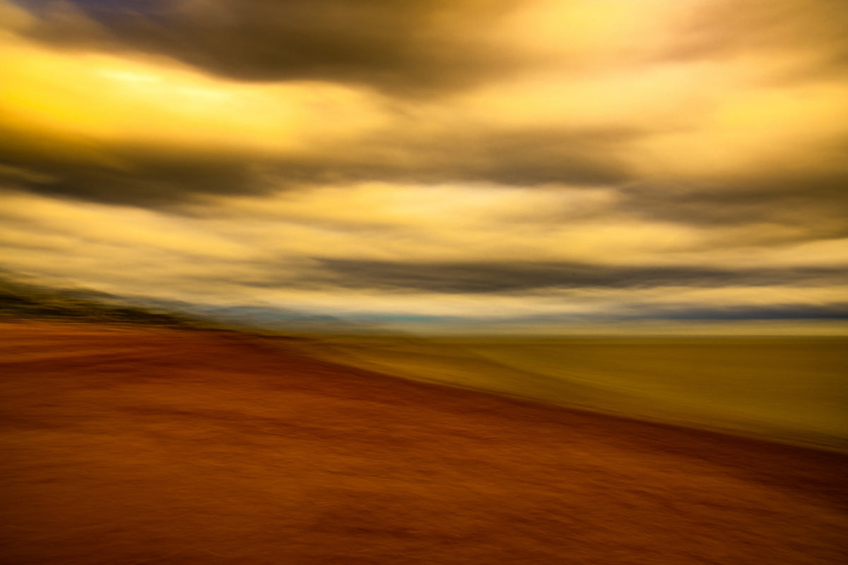
Realistic coastal photography documents a place. Painterly photography, made with intentional camera movement, captures how a place felt. For a workspace, the second usually serves you better.
A sharp, literal seascape invites comparison and detail-hunting. A softened one invites a breath. That is the difference between decor and atmosphere.
This matters most for screen-heavy work. When your day is already full of sharp edges, text, and notifications, a painterly piece gives your eye a rest rather than another task.
Our own work sits firmly in the painterly camp. If you are weighing up whether a limited edition print is worth the investment for a home office, read are limited edition art prints worth buying?.
Caring for Prints, Frames and Glare in Different Light Conditions
Light is the quiet enemy of fine art. A home office often has a bright window and a screen, which is a difficult pair for any print.
Keep these rules in mind:
- Hang paper prints away from direct sun, or use UV-filtering glass
- Position metal and acrylic pieces where glare will not hit your screen
- Rotate pieces between walls if one spot gets harsh afternoon light
Glare is the practical issue most guides skip. If a glossy piece sits opposite a window, you will see the window, not the art. Test the spot at the time of day you actually work there.
Shop Coastal Fine Art for Your Home Office
You now have a process: read your working day, choose a mood, pick a palette, size the wall, choose a material, and care for the result.
A good example of the whole approach in one piece is Indigo Moment, a limited edition of 50 printed on Chromaluxe aluminium in a limed oak tray frame.

For a smaller start, Squarine 002 - Ephemeral Break brings a softened Devon shoreline into a square acrylic facemount, ready to hang above a desk.

Your home office wall is the one surface you face every working day, and it deserves more thought than a last-minute print.
Frequently Asked Questions
How do I choose art for a home office without making it feel like a gallery?
Choose one or two pieces that share a colour palette and a mood, then stop. A single large statement piece above the desk, or a small grouped pair on a side wall, gives the room focus without clutter. Match the frame to your desk and shelving, keep the palette to blue tones, whites and neutrals, and let the wall breathe. The aim is a calm backdrop for work, not a display that competes with your screen.
Should I choose painterly or realistic coastal photography for my office wall?
Painterly work, such as photography made with intentional camera movement, softens detail and reduces visual noise, which suits screen-heavy rooms. Realistic shoreline and seascape photographs carry more information and can feel busier on a wall you face all day. If your office already has strong patterns or a lot of equipment, painterly coastal fine art is usually the calmer choice. If the room is bare and minimal, a crisp realistic print adds the texture it lacks.
What size artwork should I choose for my office wall?
Work to the wall, not to a standard size. Above a desk, aim for a piece roughly half to two-thirds the width of the desk so it reads as anchored rather than floating. On a narrow wall beside a window, a tall portrait format works better than a wide panoramic view. For video calls, keep the piece inside the camera frame and leave clear space around your head so the artwork supports you rather than crowding the shot.
Which fine art print materials suit a home office?
Acrylic facemount artwork comes with a built-in hanging system, so it arrives ready to hang. Consider the light in the room, the frame style and how much glare you can tolerate at your desk before deciding.