How to Choose Blue and Neutral Coastal Art for Office Decor

Last Updated: November 8, 2026
Quick Summary
Choose blue and neutral coastal art for office decor by matching scale to the wall, style to your working day, material to your light and palette to your furniture. Painterly coastal art suits desks and meeting rooms, while realistic work suits corridors and reception areas where people pass rather than sit.
- Measure the wall, then the furniture, then choose the print before you browse.
- Artwork should span roughly two-thirds to three-quarters of the width of the furniture below it.
- Centre a piece at seated eye level, around 120cm from the floor for most people.
- Keep gallery wall gaps consistent at 5cm to 8cm and align the group to one centre line.
- Hang art on a wall receiving indirect daylight, never directly opposite a window.
Table of Contents
- Why Blue and Neutral Coastal Art Belongs in Your Office
- Large Blue and Neutral Coastal Art for Office Decor: Making a Statement
- Modern Blue and Neutral Coastal Art for Office Decor: Clean Lines and Calm
- Painterly vs Realistic Coastal Photography: Which Suits Your Workspace?
- Choosing the Right Material: Giclée, Chromaluxe, and Acrylic Facemount
- Sizing and Placement: Getting the Proportions Right
- Coordinating Art with Office Furnishings and Lighting
- Shop Coastal Art for Your Office
- Frequently Asked Questions
Why Blue and Neutral Coastal Art Belongs in Your Office
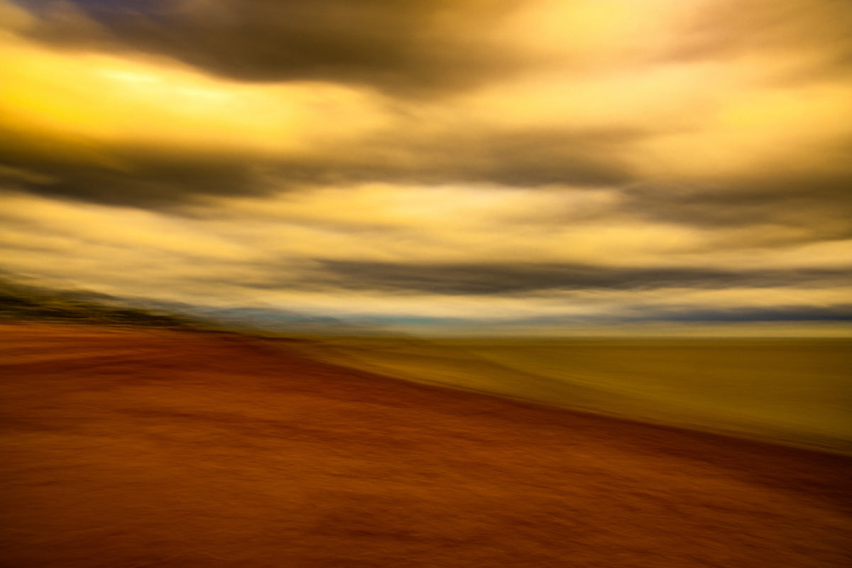
Blue and neutral coastal art for office decor works because it lowers visual noise without emptying the room of character. At paulstrettonstephens, we photograph the Devon coast using intentional camera movement, so sea and sky soften into painterly bands of blue-grey, beige and muted teal rather than hard documentary detail. That softness matters on a working wall: a screen already demands sharp focus, and artwork that competes with it leaves you tired by mid-afternoon.
The palette does the quiet work. Light blue and blue-grey recede, beige and tan warm the wall back up, and a pale white sky keeps the whole piece from feeling heavy in a small room. Colour psychology research and workplace wellbeing guidance both point the same way, toward calm, low-arousal imagery in spaces where concentration matters, as summarised in the British Psychological Society's guidance on colour and environment.
Below, we walk through scale, style, material and placement. For the shortcut version, our step-by-step guide to choosing coastal fine art for a home office covers the decision sequence in order.
Large Blue and Neutral Coastal Art for Office Decor: Making a Statement
A large piece earns its place when the wall behind your desk is the first thing a visitor sees on entering. One wide horizontal print, hung at seated eye level, gives the room a single focal point and makes a modest office feel considered rather than cramped.
Panoramic formats suit this best. Indigo Moment, a limited edition of 50, is a 10" x 30" horizontal that dissolves sea and sky into deep blue and indigo. It is printed onto a thin Chromaluxe aluminium panel inside a limed oak tray frame, giving a high-definition glossy display. The release is tiered: Tier 1 at £389, Tier 2 at £447 and the final Tier 3 at £536, with 20, 20 and 10 prints respectively. Each artwork is accompanied by a Certificate of Authenticity, signed by Paul, and secured with a uniquely numbered, tamper-evident holographic sticker.
Best for: a home office or reception wall where one statement piece must carry the room. Skip if: your wall is narrow or broken up by a door frame, where a wide panorama will feel squeezed.
Browse the limited edition coastal collection to see what is currently available in each tier.
Price tiers for the Indigo Moment limited edition print
Modern Blue and Neutral Coastal Art for Office Decor: Clean Lines and Calm
Modern coastal art for an office keeps the horizon simple and the frame minimal. Clean lines and a restrained palette read as contemporary without tipping into coldness, which is why open edition prints suit a workspace that may be redecorated or moved.
Seascape Serenade is our open edition piece: an ICM photograph from the Devon beaches, blending soft blues, greens and golden hues, printed on Hahnemühle Photo Rag with giclée quality. It is available on archival paper, on metal, or acrylic facemounted.
Best for: a first fine art purchase, or a second office that needs the same calm without a limited edition commitment. Skip if: you are building a collection around scarcity and resale value, where a numbered edition matters more.
See the open edition fine art photography prints for sizing and finish options.
Painterly vs Realistic Coastal Photography: Which Suits Your Workspace?
Painterly coastal photography suits a workspace that needs calm; realistic coastal photography suits one that needs energy. A realistic seascape records a specific wave at a specific second, with crisp detail in the foam and wet sand. A painterly image, made with intentional camera movement, blurs that detail into streaks of light and colour, so the eye rests rather than scans.
For an office, that distinction decides more than taste. A sharp, high-detail beach scene behind a monitor pulls attention outward every time you glance up; a softened coastal horizon gives the eye somewhere gentle to land and then releases it. We lean toward painterly work for desks, reading chairs and meeting rooms, and toward realistic work for corridors and reception areas where people pass rather than sit.
A common mistake is mixing both styles on one wall. Keep a single treatment per sightline, and the room will feel deliberate even if the pieces differ in size.
Choosing the Right Material: Giclée, Chromaluxe, and Acrylic Facemount
The material decides how the blues behave under your lighting. Giclée on archival paper gives a textured surface. Chromaluxe HD metal gives a glossy, vibrant, high-definition finish. Acrylic facemount sits between the two, with a glass-like clarity that makes a print look embedded in the wall.
| Material | Surface and feel | Best for | Watch out for |
|---|---|---|---|
| Giclée archival paper | Matte, textured, soft colour transitions | Framed pieces, softer light, traditional rooms | Needs glazing and a frame; reflections if glass is used |
| Chromaluxe HD metal | Glossy, vibrant, high definition | Deep blues, modern rooms, strong daylight | Glare if hung opposite a window |
| Acrylic facemount | Glass-like, sharp, flush to wall | Minimalist offices, large formats | Heavier; fixings must suit the wall |
Each has a place, and the choice is less about quality than about the light in your room. If you are weighing acrylic against metal in detail, our collector's guide to acrylic facemount versus metal prints sets out the trade-offs side by side.
Sizing and Placement: Getting the Proportions Right
Sizing is where most office art goes wrong, and where ranking pages are thinnest: they list print dimensions but rarely explain how to measure a wall, position a piece above a desk, or plan a gallery wall around a monitor. The method below works for a single Squarine as well as a multi-piece arrangement.
Measure the wall first, then the furniture, then choose the print. Artwork should span roughly two-thirds to three-quarters of the width of the furniture below it.
Hang height is decided by the seated eye line, not the ceiling. Centre the piece at roughly eye level when seated, which for most people means the middle of the artwork sits around 120cm from the floor.
For a single piece above a desk, leave at least 15cm between the frame edge and any door frame or corner, and aim for 20cm to 25cm of clear wall between the bottom of the frame and the top of the desk.
For a gallery wall, plan on paper first. Keep gaps consistent at 5cm to 8cm, align the group to a single centre line (usually the seated eye line), and treat the arrangement as one shape: a rectangular group reads calmer than a scattered one.
Match the format to the material. A large acrylic facemount is heavier and sits flush to the wall, so it needs fixings suited to the wall type and a helper for installation; a framed giclée on paper is lighter and easier to adjust, making it the better choice if you are likely to rearrange the room.
Coordinating Art with Office Furnishings and Lighting
Most guidance on coastal art stops at 'match the blues to your walls'. In a working office, coordination is more mechanical: the artwork has to answer the desk, the floor, the wall paint and the window light at once, or it will look like it was hung in a different room.
Start with the desk, the largest object in your sightline. Pale oak and ash desks pull the beige and tan out of a coastal print and make the blues read cooler and cleaner.
Wall colour sets the ceiling and floor of the palette. On off-white and warm grey walls, blue-grey and muted teal prints sit naturally.
Flooring and textiles decide how much warmth the room can carry. Pale wood floors and natural fibre rugs (sisal, jute, wool) already supply the neutral half of the palette, so the artwork can lean cooler.
Lighting is where most office art fails. Hang the piece on a wall that receives indirect daylight rather than direct sun, because direct sun will fade any print over time and wash out a glossy metal or acrylic surface within an hour of sunrise.
Finally, balance calm with a trace of personality. A coastal print that is entirely muted can make a workspace feel clinical, so let one element carry the character: a warmer sky, a deeper teal, or a single band of indigo. That one note stops the room feeling like a waiting area.
Shop Coastal Art for Your Office
Choosing blue and neutral coastal art for office decor comes down to four decisions: the scale of the wall, the style that suits your working day, the material that suits your light, and the palette that suits your furniture. Get those right and the piece settles into the room rather than sitting on top of it.
At paulstrettonstephens, our limited editions are released in tiers, so early buyers secure the lowest price in the run, and our open editions make the same painterly coastal style accessible as a first piece. Browse framed coastal art prints to find a curated selection for your office.
Your office wall is doing more work than you think: it is the first thing you see when you sit down and the last thing a client sees before they leave. Choose a piece that gives the room a horizon. Explore the coastal collection, pick your finish, and let the sea hold the quiet while you work. Get started with paulstrettonstephens and bring a calmer, more considered wall to your workspace.
Frequently Asked Questions
How do I choose coastal art for an office?
Start by deciding on the mood you want: calm and meditative or fresh and energetic. Blue and neutral coastal art suits most professional spaces because it feels soothing without being distracting. Measure your wall and furniture to pick a size that balances the room, then choose a material that handles the light in your office. Limited edition prints add a touch of exclusivity that mass-produced pieces lack.
What colours go well with blue coastal wall art?
Neutral tones like beige, grey, tan, and white let the blues stand out without competing. For a cohesive look, echo the artwork's palette in soft furnishings, such as a grey chair or a beige rug. If you prefer a bolder scheme, pair deep teal with warm wood tones. Avoid strong reds or oranges, which can clash with the cool calm of coastal pieces.
What size artwork works best above an office desk?
A general rule is to choose art that spans about two-thirds of the desk's width, leaving breathing space on either side. For a standard 1.2-metre desk, a horizontal piece around 80 centimetres wide works well. If your desk is wider, consider a larger statement print or a set of two to fill the space. Always hang art so its centre is at eye level when seated.
Is realistic coastal photography suitable for office decor?
Realistic coastal photography can work beautifully in an office, especially if you want a literal connection to the sea. However, painterly styles like intentional camera movement (ICM) often create a softer, more abstract feel that reduces visual clutter and promotes focus. The choice depends on your preference for crisp detail versus dreamy atmosphere. Both can be effective when matched to the room's overall design.